

Mid October 2020, Diana Stoughton, owner of Gryphon’s Tea in Bloomfield reached out to re:Bloom because she was interested in updating her website to attract more customers. She shared that her main concerns were that:
During our initial consultation, we learned that Diana was struggling with:
We decided to get to the source of the problem by talking to tea enthusiasts. We scheduled user testing where frequent online shoppers of tea gave us feedback on the website.
When asked about how users tend to choose tea, 25% of users responded that it depended on external factors such as weather, mood, etc.
“I like herbal teas when I’m sick or when it’s summertime.”
Another common theme among our users is that they prefer to try new teas -
“I look for unique flavor blends and things I don’t normally see on the shelf”
“I like to try new things and often go for “limited editions” because there’s a sense of urgency”

Gryphon’s Tea has a lot of …. well, types of teas. To address this, we wanted to give users smaller groupings to pick their tea from. We categorized the teas by type and included the categories on the home page and navigation bar. We also added green “flags” to call out special teas that would have had special signage in the store such as “Diana’s Favorites” or “Seasonal Special.”
Finally, we added in a reviews feature so that customers wouldn’t just be hearing from Gryphon’s Tea about how good the tea was ! They’d hear from other customers as well.
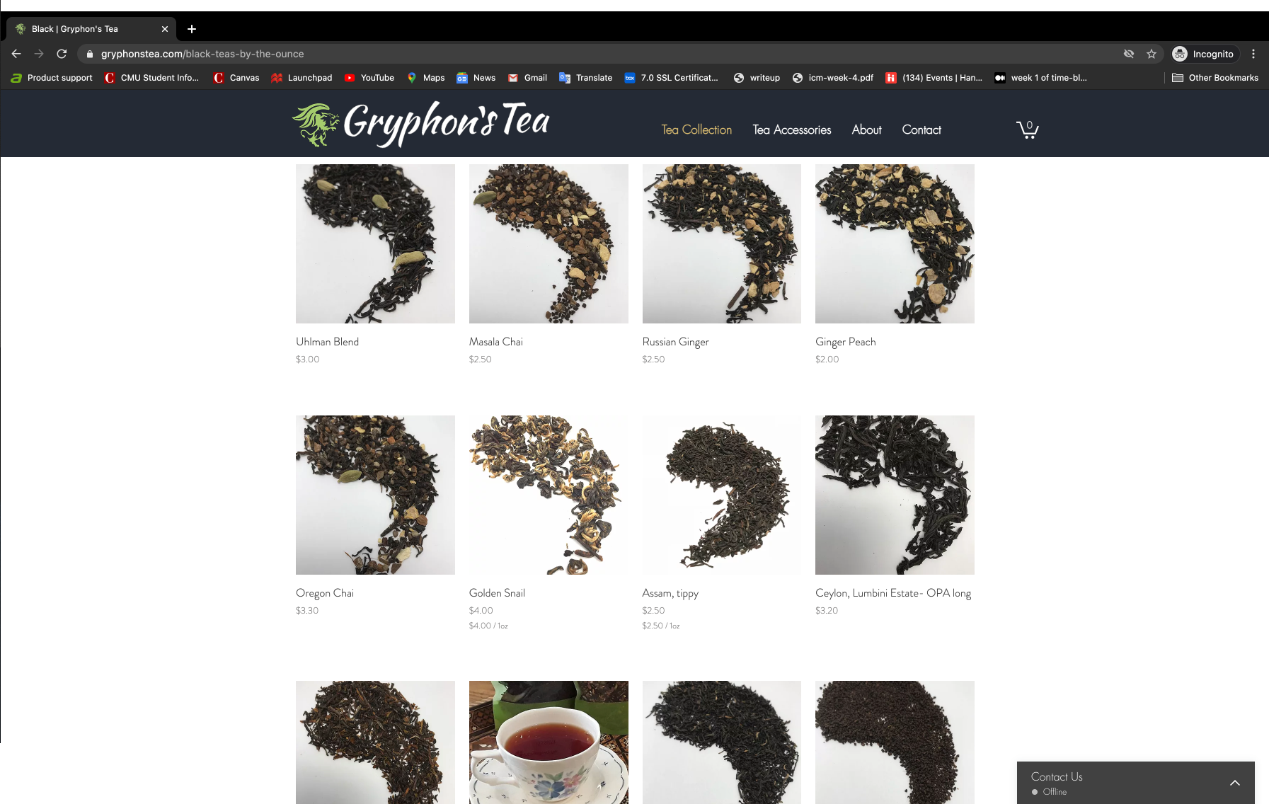
Pictures speak 1000 words. We knew that Gryphon’s Teas should also include photographs of their products to further showcase the extensive offering. Diana already had clear, standardized photos of the dried tea but we needed to address the lack of information on her website.
We designed a store page that shows a picture of the dried tea leaves by default but added pictures of the brewed tea on hover. This was a really neat feature that Gryphon’s Tea could take advantage of their digital storefront that would not have been as easy to pull off in the store / current packaging.
We also recommended including other information such as flavors, caffeine content, and brewing instructions - answers to frequently asked questions in stores.
The original website did not make it clear how 1 unit of tea was measured. Customers were confused whether Gryphon's Tea was selling by the bag or by the ounce. We ensured that the shopping experience was consistent throughout the website. By going with “by the ounce” sales, the customer could let us know exactly what they wanted.
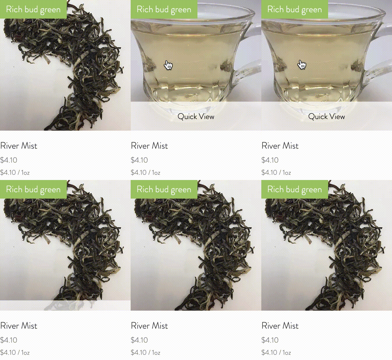
In the original shop page, there is a hover animation on each tea item that shows a description of the tea. We removed imaged based descriptions and listed it on the website as text directly. Then, we changed the animation to show an image of the brewed tea. This made the website ADA compliant and friendlier to those using screen readers. As a result, we were able to keep the same animation but it no longer obstructed important information.
We moved the shipping cost calculation to the end of the checkout process. We allowed Diana to remain transparent with her shipping costs by including it on a page accessible by the footer called “Shipping and FAQs”. This ensured that users concerned about shipping would be able to find the information and users who were less concerned would see it at checkout so that customers would have a chance to checkout the tea selection before turning away because of shipping price. In addition, we recommended that Gryphon’s Tea reduce the shipping cost on large orders to incentivize customers.
re:Bloom helped design a new website for Gryphon’s Tea with the goal of taking advantage of benefits of a digital storefront such as adding images of brewed tea, information about the tea, and even reviews. Since the site launched in January 2021, the number of monthly orders has grown by 60% and the number of unique visitors have grown by 10% to over 400 site visitors.